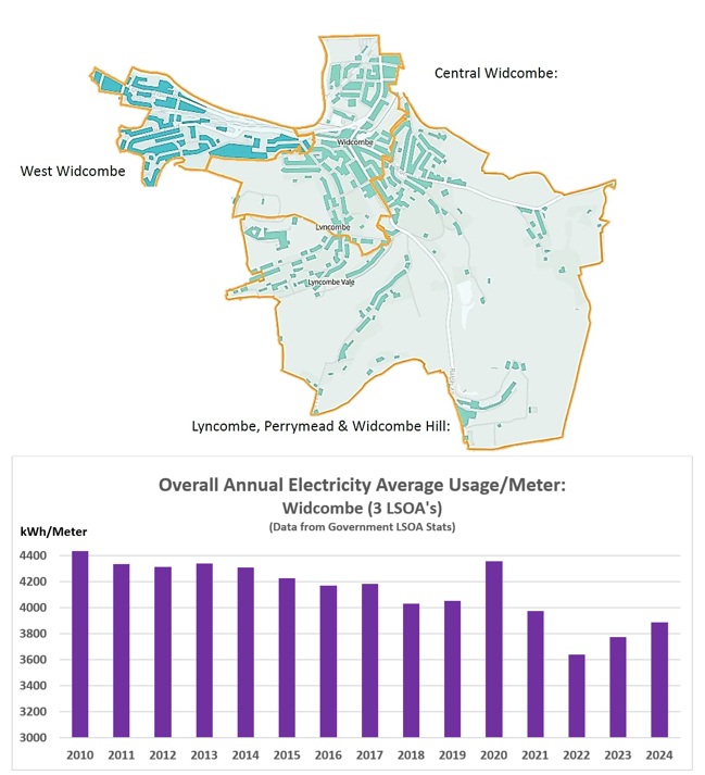
This first graph shows the Overall Average Annual Electricity Usage (kWhr)/Meter across Widcombe. This data is from the Office for National Statistics (ONS), and it covers the period from 2010 to 2024. This data covers the 3 main areas of Widcombe (called LSOA’s or Lower Layer Super Output Areas): (a) West Widcombe, (b) Central Widcombe and (c) Lyncombe, Perrymead & Widcombe Hill. Overall, between 2010 and 2024, the Average Electricity Usage/Meter, across the whole of the Widcombe area has dropped by 12.3%, with a peak in 2020 (probably due to Covid, and people being home for much of the day).
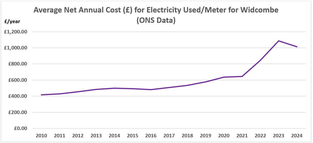
The second graph calculates the estimated Annual Net Electricity Bill (£/Meter) across the same 3 main areas of Widcombe. This Average Selling Price (p/kWh) was obtained from this UK Govt website link… Historical electricity data: 1920 to 2024.
This graph shows how Electricity Pricing increased slowly between 2010 and 2021, and then took off after the Ukraine War started, in February 2022. The increase in the Average Annual Electricity Cost over the past 4 years has been 60.2%! However, the Average Annual Electricity Cost did drop in 2024 compared to 2023 by 9.5%.
This shows a why it is important to try to Retrofit our Homes to make them more Energy Efficient.
Entry Photo by Tirachard, FreePik.